Themes & Appearance
How the app's own interface looks is a choice for this device only — your theme is never sent to anyone, and the 3D viewport keeps following the scene's environment (sky, background, grid), whatever the theme.
Choosing a theme
Settings ▸ Interface ▸ Appearance ▸ Theme has five built-in themes:
| Theme | Look |
|---|---|
| Dark | the default — dark grey panels, blue accents |
| Light | light panels and dark text |
| Green console | green-on-black, like an old terminal |
| 8-bit | a retro palette |
| High contrast | strong borders and maximum text contrast, for readability |
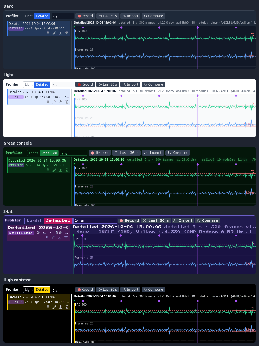
Since 1.21 every theme is checked for readable contrast: the Profiler's numbers, the number fields, the Explorer's sidebar, the shader and node editors and the light theme's drawers all keep their text legible (at least 4.5:1 for the Profiler's text).
The theme applies at once and is remembered on this device; a built-in theme is painted before the first frame on the next visit, so it never flashes the default. Icons follow the theme's colours too.
Since 1.30 every theme follows the one-accent rule: blue marks what you can act on or have selected, and orange is kept for Play, recording and live states. The light theme and custom themes now restyle every surface — windows, menus, dialogs, the HUD and the node editor — because every colour comes from the design tokens.
Making your own theme
Settings ▸ Interface ▸ Appearance ▸ Custom theme:
- Export template downloads the active theme as an editable
.theme.json— every colour the interface uses, by name (surfaces, fields, text, muted text, borders, accents, menus, scrollbars…). Since 1.21 a theme also carries state colours —--ink-bad,--ink-warn,--ink-goodfor error, warning and good text, and--accent-fill/--on-accentfor a filled accent chip and the text on it, and a custom theme may set them. Since 1.30 it may also set the redesign's tokens —--bg-app,--surface-1,--surface-2,--surface-inset,--border,--border-strong,--text,--text-2,--text-muted,--text-faint,--accent,--accent-soft,--accent-text,--live,--warn-text,--danger,--badge-bg,--badge-text; any it leaves out are derived from its other colours. - Change the colours in any text editor.
- Browse… loads it back. It appears in the Theme list under its own name, and as a chip under Custom theme; the chip's ✕ removes it.
Custom themes are saved in this browser. To use one on another device, copy the .theme.json across and load it there.
Other things that are yours to set
- Line colours — the wireframe, the selection outline and the Edit Mesh overlay: Settings ▸ Scene ▸ Wireframe & outline (see Mesh Editing).
- Density — Settings ▸ Interface ▸ Density: Comfortable (the default) or Compact, tighter rows and controls on a computer screen; see Settings.
- Render mode — Shaded, Shaded + AO or Wireframe, per device (Z cycles them): see Camera & View.
- Toolbar — which buttons the bottom bar shows, in what order and where: see The toolbar.
-
FPS and draw calls — a small counter in any mode: Settings ▸ Interface ▸ Viewport ▸ Show FPS + draw calls.
-
Text selection — menus and panels do not select text when you drag across them; Settings ▸ Interface ▸ Allow text selection everywhere turns it back on (see Text selection).
Finding a setting
The search box at the top of Settings matches names, descriptions and keywords — search dark for the theme. Esc clears it. See Settings.